The Most Important Changes to Make to Your Building Materials Website
ZACH WILLIAMS
Owner & Founder, Venveo
Table of Contents
Overview
Episode Intro
How People Have Been Shopping Since the Start of COVID-19
The Biggest Takeaway From 2020
The Biggest Mistake You Can Make on Your Website
Key Areas to Focus on When Auditing Your Website
Simple Improvements With Big Impact
Building Materials Brands With Great Websites
People are spending more time than ever online, and key players in the building materials industry are no expectation. Let’s look at some common mistakes and quick fixes that you can make to your website today to continue to drive awareness, leads and sales.
episode 107
The Most Important Changes to Make to Your Building Materials Website
0:00/0:00
Episode Intro
More About This Show
The Smarter Building Materials Marketing podcast helps industry professionals find better ways to grow leads, sales and outperform the competition. It’s designed to give insights on how to create a results-driven digital marketing strategy for companies of any size.
In this episode, Zach and Beth talk to Mitch Harris, Venveo’s Design Team Architect, about the most important changes building material manufacturers should be making to their websites in 2021.
How People Have Been Shopping Since the Start of COVID-19
Online shopping is on the rise, especially since we’re all stuck at home more these days.
Recently Venveo conducted some research on the building materials industry, and the data shows that 40% of both homeowners and pros found new brands to buy from online, since the start of the COVID-19 pandemic this year.
But what does this mean for building material manufacturers? “There are changes that you need to be making to your site today heading into 2021 in order for you to continue to drive awareness, leads and sales,” explains Zach.
The Biggest Takeaway From 2020
Mitch spends the most time, compared to anyone at Venveo, evaluating and auditing building material manufacturer websites. He is an expert on website design, functionality and the online shopping experience.
“I've been looking forward to this interview, Mitch, because you and I geek out more about the intersection between design, data and our audience probably more than anybody,” Zach says.
One of the biggest changes that manufacturers need to make to their website heading into 2021, based on the shifts that we've seen happen this past year, is filling information gaps for their customers.
“The biggest shifts or the biggest takeaway we've seen this year is that the real differentiator, the manufacturers that have done well during 2020, have been the ones who are able to communicate things like price, things like availability and really connect the dots for people in an area where we're seeing all these gaps,” says Mitch.
According to Mitch, the more robust your systems are in automating and digitizing the whole fulfillment process itself, the more success manufacturers are seeing.
The Biggest Mistake You Can Make on Your Website
There are some aspects of your website design that can negatively impact your customer’s experience, and ultimately, your traffic. Mitch notes that one of the biggest mistakes a building material manufacturer can make with their website is not understanding what their audience is really looking for.
“I think a lot of manufacturers like to talk about themselves. It's a very natural thing to want to do,” says Mitch. “Building manufacturers talk about benefits. They talk about features. But they don't always address the reason why somebody is coming to the website in the first place, which is that they're looking for something.”
Mitch suggests that manufacturers take the time to understand exactly what site visitors are looking for, then make sure to give them what they want. “The closer you can get to understanding what that something is and the better you can deliver on that something, the better your website is going to perform,” he explains.
What your customers are looking for can vary depending on your product and what problem it solves, whether you're in more of a commoditized space or if you're a niche, architectural type product.
“Understanding what they're looking for and finding ways to over-deliver on that promise is usually the key to success,” says Mitch.
Key Areas to Focus on When Auditing Your Website
Mitch handles all of Venveo’s UX audits, which is where he dives into a website and digs through each page to see how it’s working — looking for the good, the bad and the ugly.
“There are things I typically grade websites on. There are some standards, some baselines and best practices,” explains Mitch. “And then there's another bucket, which is unique to every client and what their goals are.”
As far as website standards go, here are a couple basics that Mitch and the design team look to first.
Information Architecture
How your website is organized — called a website’s Information Architecture (IA) — plays a key role in how your customers are able to navigate through your site. This could be the difference between providing a positive experience because your customer can quickly and intuitively find what they are looking for or a disappointing one where they leave the site frustrated and empty-handed.
This is where Mitch starts looking for gaps, paying special attention to the clarity of navigation as well as page and product organization, hierarchy and information structure.
“What I really try to hunt out is what I call opportunities for confusion,” says Mitch. “Most of the time, if you've built your website or you've sat on your website for a while, you become blind to these things because you're just used to how you've organized it and it makes sense to you.
“We see websites all the time that have two pages that are very similarly named, but maybe one of them is in the navigation and one of them is linked to some other page. And you think they go to the same place, but they're actually totally different pages,” says Mitch.
Product organization is an art, according to Mitch: “It’s an art of understanding how your customers might think of different applications for the same product. So do you organize your site by the problem it solves or by color or by how you would think about it?”
Page Content
Mitch and the design team also take the content of the pages into consideration to see if the content is providing value to your customers.
“A lot of the value comes in with the visual design, yes, but also the written copy on the page. Is this brand positioning itself as someone who can solve somebody's problem when they're landing on the website? Are they making the right things easy to find?” says Mitch.
Simple Improvements With Big Impact
Not everybody can redesign their site today, but everybody can make small improvements. You can make changes that will find more ways to engage with website visitors, so you can become a real resource for customers.
Here are a few improvements Mitch and Zach recommend manufacturers make to their site today, based on how buyer habits are changing.
Promote Your Products
“The first one out of the gate, quick low-hanging fruit, is figure out what it is that your audience is coming to your website for, and make sure you promote it,” says Mitch. “The most obvious way to do that is to just push people to your product section a little more or provide more links to that area of your website out of the gate. That's one quick one.”
Mitch notes that one of the most highly trafficked areas of a manufacturer’s website is the product section. Potential customers are primarily coming to your website because they already know what you manufacture and what kind of product they're looking for.
“The quickest five-second change you can make today is [linking to your product section in] your hero banner or make sure it's prominent now,” says Mitch. “Move [Products] even to the first or last position in the navigation. That's one of the laws of UX. People tend to remember the first and last things in a list. That's a quick change.”
Set Expectations & Communicate Delays
“The other thing I would do is add a little banner at the top of the screen that says, hey, here's what we're doing for COVID-19,” says Mitch. “That's a valuable thing to be able to have. If there are certain products that are taking longer because of your infrastructure or because there was some delay in material delivering, let people know that. Use your website as a platform to communicate.”
Mitch notes that it's okay to say it's going to take a little bit longer, but what you don't want is a customer to place an order and then get frustrated because it took longer than they expected.
The bottom line: You’ve got to get customers answers quickly. It’s about convenience. You can do this with chat; however, setting up a chat system if you don’t already have one will be a more involved process. But this applies to your contact form as well. Customers who have questions tend to avoid filling out a contact form because they are unsure if or when they will get a reply.
“I would say if you wanted another low-hanging fruit, if you have a contact form, put a little blurb next to it that says, we'll get back to you in X amount of hours or days or whatever it is,” says Mitch.
It is then important that you actually respond within that timeframe or else you will cause your customers to lose trust in your brand.
Just set expectations and be transparent. Getting in front of a visitor’s potential anxieties is going to increase the potential for them to actually fill that form out, ask their question, get a quick answer and make a purchase with you, as opposed to shopping with somebody else.
Provide Value
It is important to find a way that makes sense for your brand to interface directly with your end customer, and give them something of value.
“I think from my perspective it's not only important because it helps you measure the success of your site and [if you are] are you speaking to your audience, but it also positions you from the standpoint of, are you delivering value first?” explains Zach. “Starting with value versus taking. Are you a taker or are you a giver? And I think that's also incredibly underutilized and undervalued.”
Mitch offers one quick approach. “Create one piece of downloadable content that you think is going to be high value. Gate it so people have to give their information in exchange for it and put that on your website so that you actually have a touchpoint on your website where you can get people's information, where you can start a conversation, where you can get that process rolling,” explains Mitch.
A downloadable will provide value to your customer by bringing you closer to your audience, while also acting as a lead generation tool.
Building Materials Brands With Great Websites
If you are wanting to check out a couple of websites that are designed well, Mitch shares two of his favorites.
“They are going to be prettier websites because I do think aesthetics has value,” notes Mitch. “If I can cite another user experience rule: There's a UX rule called aesthetic-usability effect, which is that users often perceive aesthetically pleasing websites or designs as being more usable.”
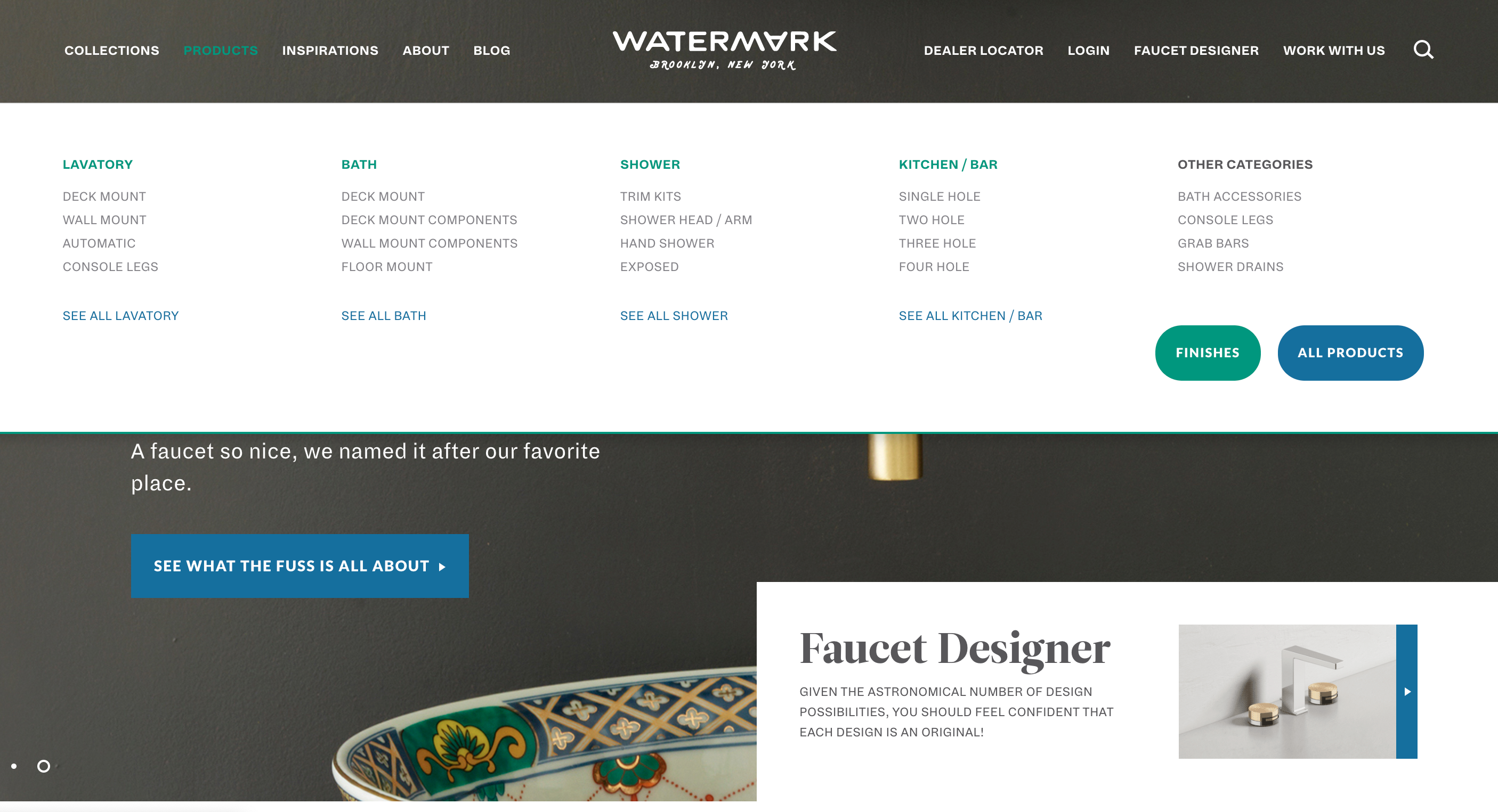
“They're a high-end faucet manufacturer. Kanye West has one of these faucets,” says Mitch. “He could have literally any faucet in the world, and he has a Watermark faucet. So that's probably one of my favorites. I think it's a really modern design.”
Mitch believes that Watermark Designs’ website is not only aesthetically pleasing but has a strong Information Architecture.
“There's the aesthetic component which I mentioned. But there are also a few other things. I talked about product organization and I actually like the way their products are organized. They're split into collections and products,” explains Mitch.
“They have a ton of products, more than you would expect for a really high-end manufacturer,” continues Mitch. “And the collections are organized by aesthetic, and then products are organized by bathroom, shower, kitchen, bar, etc. You have these categories where you can start to drill down specifics. For example: If you’ve got a shower, you can start to filter it based off of your selections and what your requirements are for the project. And I think that's really valuable as well.”
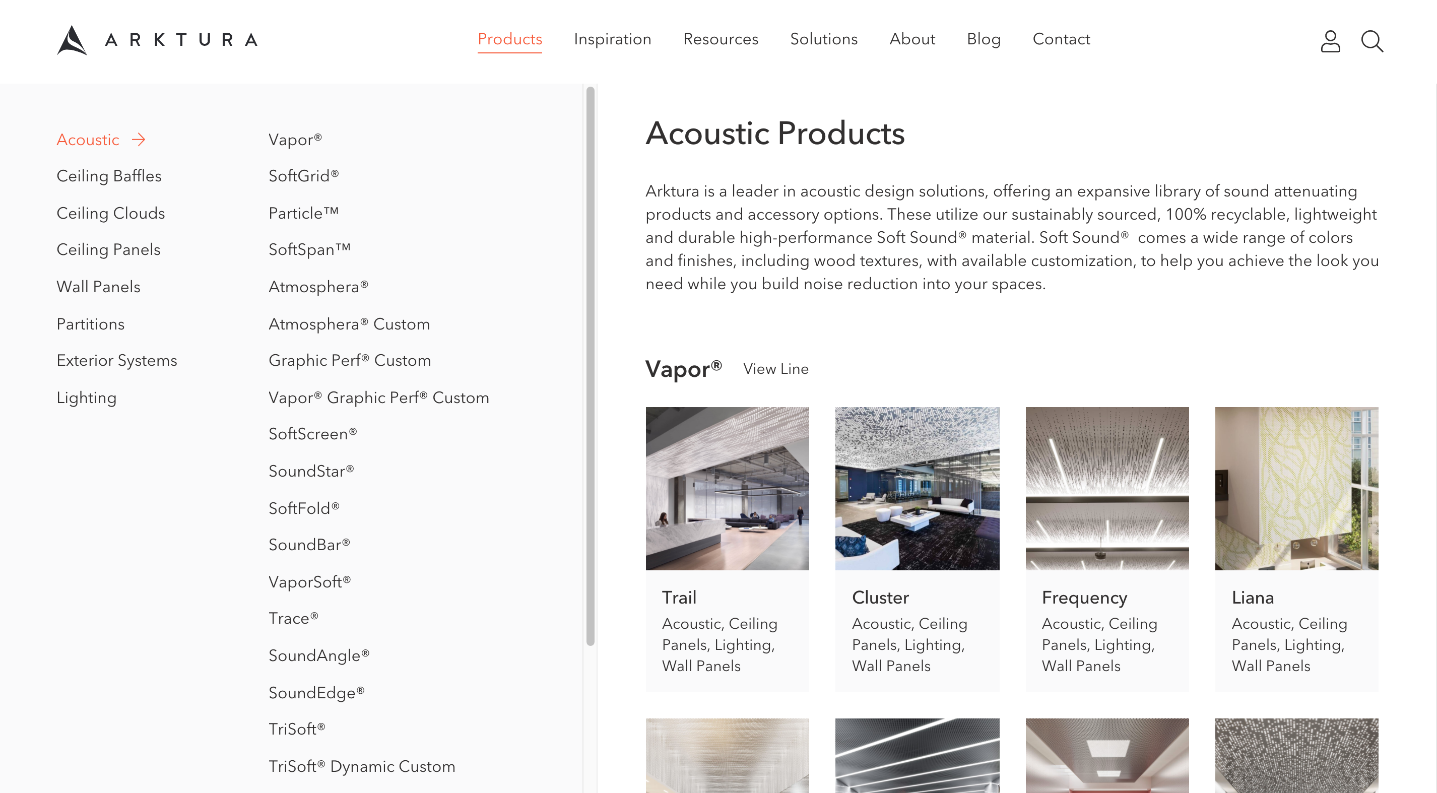
Another site that Mitch thinks highly of is Arktura's website. Arktura is a designer and manufacturer of ceilings, walls, partitions and facades.
“The product organization on this recent iteration of the website is much improved,” says Mitch. “Again, you've got categories of what you're looking for. And again, they have a very high-end architectural product, which I think works well for the aesthetic of the website and how they've chosen to do that.”
Beth is also a fan of the Arktura website noting that their product page is one of the best long-form product pages she has ever seen.
“It's not missing a single speck of information, but it’s still interesting,” explains Beth. “Things are served to the user in a variety of ways so you're able to consume information in any number of ways that keeps you engaged and scrolling. I think their product pages are phenomenal.”
Arktura’s website boasts lots of graphic design appeal and an interactive user experience.
“You can click through a couple of different features, which sometimes you just want to list those out, but here, the user can click it. And there's a graphic that changes, which adds just a little level of liveliness,” explains Mitch.
The website also features some important calls to action on the site. “I can view the downloads. I can find a rep. I can get a quote,” explains Mitch.
Building materials manufacturers miss opportunities on their website, simply because they don’t give site visitors a next step or immediate action.
“It's giving me those next steps of what I should do now that I've looked at this product and let's say, I want it. What do I do now?” notes Mitch. “If you can answer that question, man, that's going to get you so much. If you can make that as obvious as possible, that's the key to success.”
Got a Question?
If you have questions about any of the website changes or recommendations we have discussed, we want to help! Shoot us an email at podcast@venveo.com.
free data guide
get deeper insights into what architects want
Do you want more traffic?
Find out how many leads your website SHOULD be getting through our Traffic Projection Analysis.