Loading preview...
Reach out to us for any inquiries or support.
We’re here to help you with all your needs.
Get in touch with our team anytime.
How We Help
Why Venveo
Resources
Venveo is an award-winning digital marketing solutions provider. Since 2003.
©2026 Venveo
Your HVAC website is a salesperson who’s always online and always ready to convince people to call you, book an appointment, or take some other action you want.
Good website design doesn’t need to be fancy or look cool. A simple website that makes it clear what you do and who you do it for will convert more people into leads than one that prioritizes looks over lead generation.
Every extra click, every vague headline, and every slow-loading page costs you leads.
This article has two main sections:
Use the first section for inspiration and the second to understand what it takes to convince a visitor to become a lead.
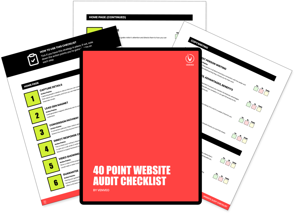
And if you want access to our 40-Point Website Checklist Template, which covers what you should look for on your home page, about page, and landing pages, then grab it below. You'll get a PDF you can score yourself with.
Download Free Checklist
Get a copy of our 40-point website audit checklist. PDF format with a handy table of contents and interactive checkboxes to grade yourself.
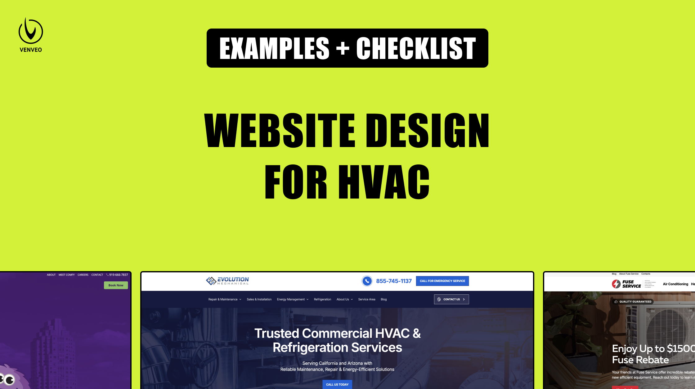
Here are 10 examples of HVAC websites across the US with a quick breakdown of what makes them good (and what could make them better).
If you’re looking to design or update your HVAC website and know you need some professional help from a marketing agency, then connect with our team of experts to get started.
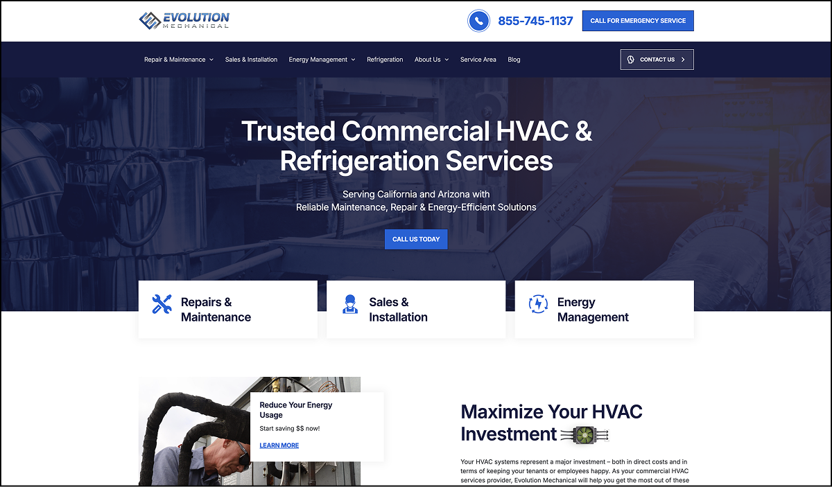
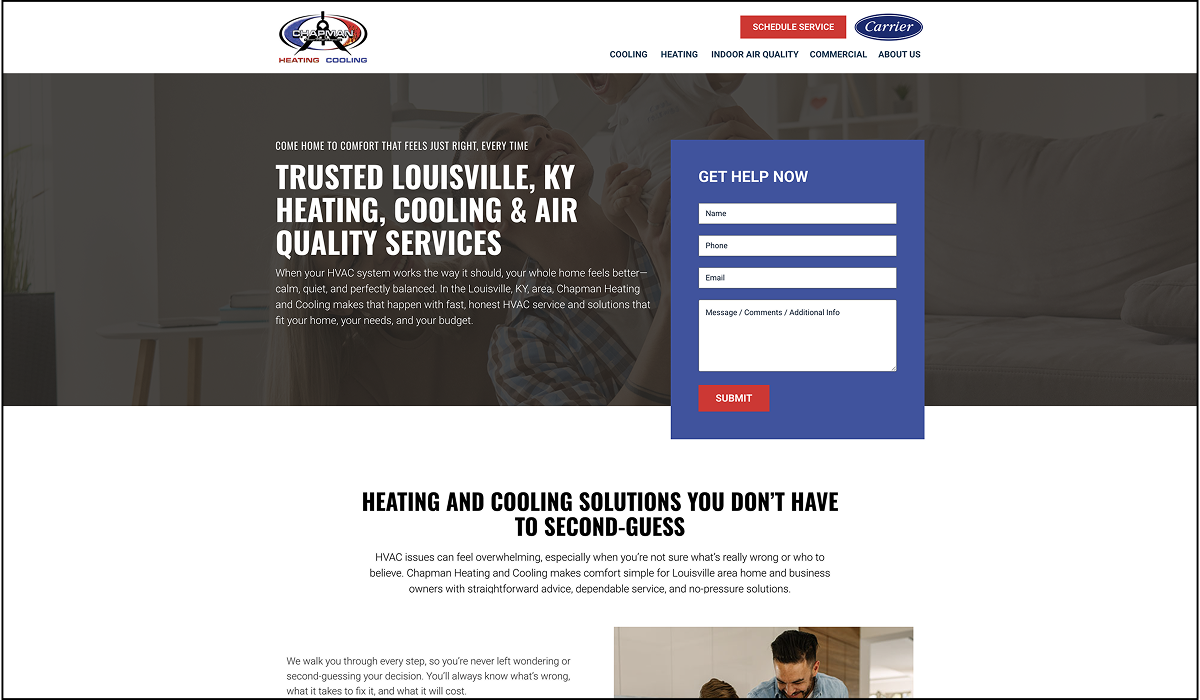
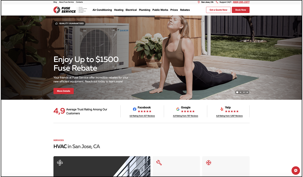
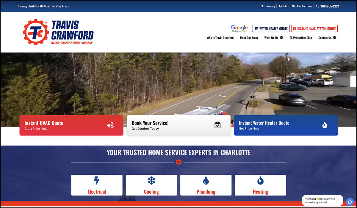
What’s Good
One thing that could improve this site’s hero section is to add some social proof in the top section. They could add some review stars, testimonials, customer logos, or even a statement backing up their claim about reliability.
The words on your page (the copy) matter more than the design itself. When making statements, be specific if you can. For example, here’s a rewrite of the subheadline:
After: Trusted by more than {number_of_customers} companies throughout California and Arizona over the past {number_of_years} years.
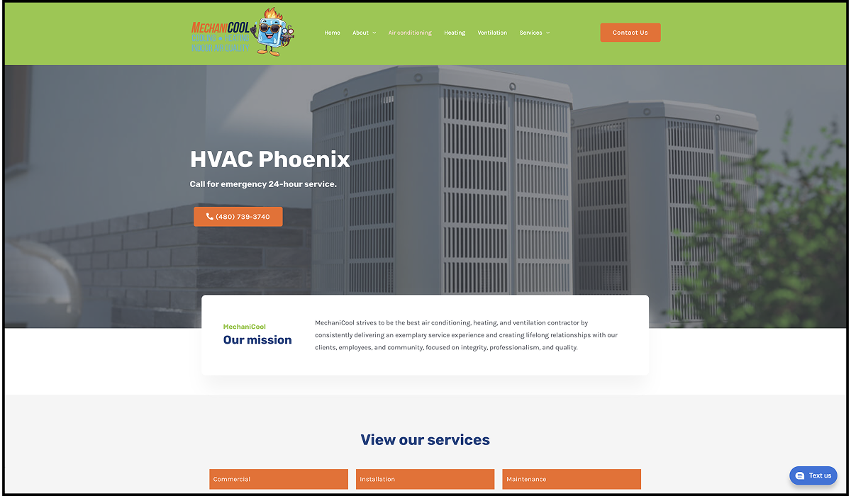
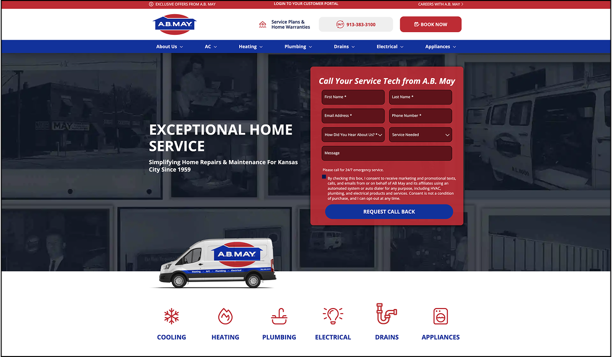
What’s Good
The mission statement rarely needs to be on the home page. Despite what many businesses may think, most customers don’t care about your mission as an HVAC company. Adding it to the home page this high up takes up valuable real estate that could be used to overcome objections and convince the visitor to take the next step.
A better section to put here would be something that demonstrates proof, like testimonials or ratings across Google, Angieslist, and other customer review aggregators.
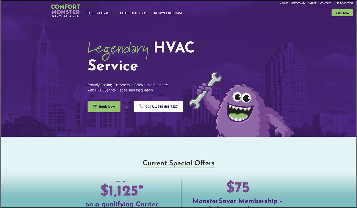
What’s Good
What’s Good
When you have enough demand (leads), you want to add friction so you can focus your time on the best leads. Adding a form does that. All things being equal, if you can get better leads, you can charge more, which means you make more money for less work.
That’s how you win in business.
What’s Good
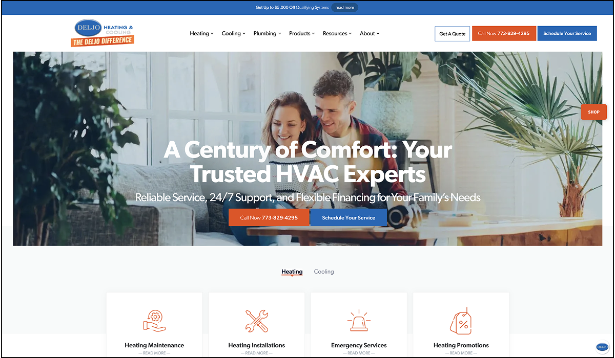
What’s Good
There’s always room for improvement, though. For example, it isn’t clear what area they serve from the main section. Adding a service area is generally a good idea for both site visitors and SEO.
What’s Good
Here’s an example of what fixing that guarantee placement would look like:
This brings the quality guarantee badge closer to the headline, adds a border around it to make it stand out more, and aligns the content in the middle of the section to focus the visitor’s attention when they first land on the page.
What’s Good
What’s Good
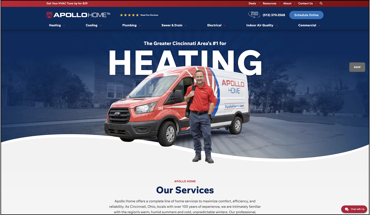
The headline could be better here. It’s a nice tagline that rhymes, but it means nothing to the vast majority of people who visit this page.
Your headline should, at a minimum, highlight the main problem you solve. The blue color used for “Done Right” also doesn’t contrast nicely with the background image and fails accessibility standards.
What’s Good
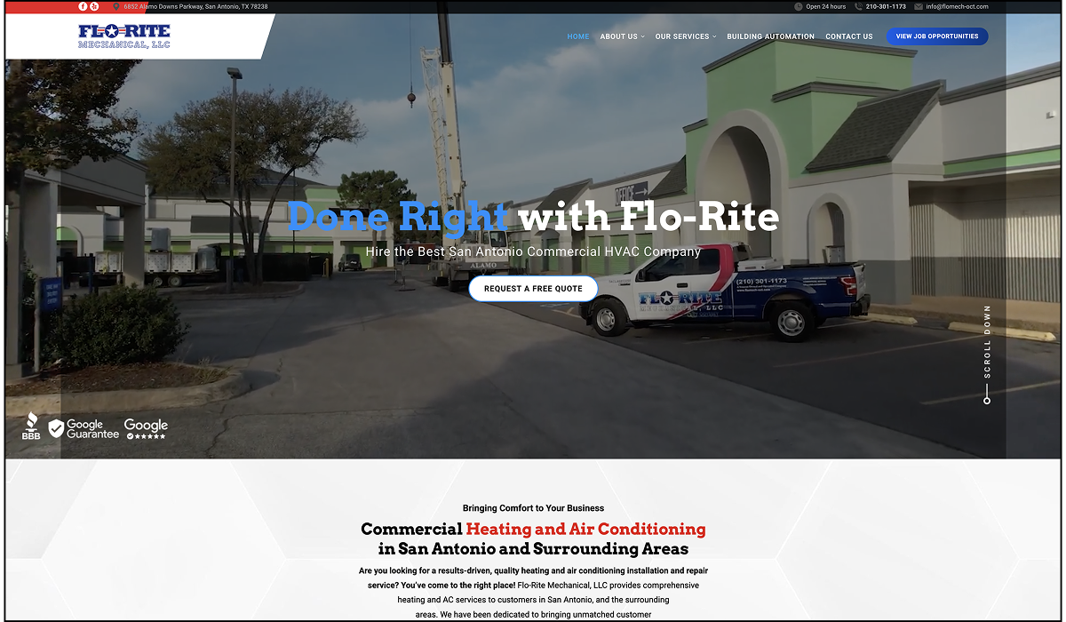
There’s a decent amount that could be improved here, though. They don’t have a headline on the page because the image is a video (very well shot, by the way).
This is a common mistake people make where they emphasize form over function. I’m sure they’re very proud of their video and want to highlight it, but it’s important to remember that you should design your company website for your potential customers, not yourself.
A lot of other resources on this topic spend paragraphs explaining why you should use responsive design so things are mobile-friendly. But that’s table stakes these days.
And no amount of mobile-responsive design is going to help you get leads if you don’t have the core sections you need to convince website visitors to do what you want.
Earlier we said your website is your online sales person. If that made sense to you, then you can think of this section like your sales script for booking appointments.
The first section people see when they land on a page on your website is what we call the “Hero” in the marketing world. This is the most important section of the page. It’s where you get to make your first impression.
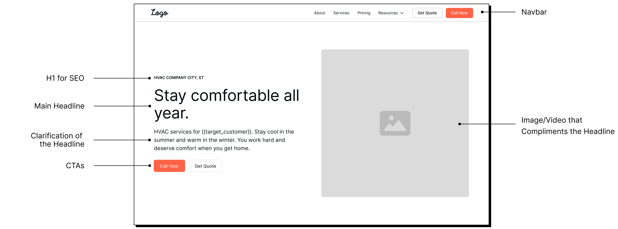
Within 4 seconds, someone should understand exactly what you’re trying to convey and what to do next. Don’t overcomplicate your navigation at the top or get crazy with fancy animations or background video that’ll just make the page load slower.
The words matter more than the design itself. Here are five questions your hero section should answer when reading it:
Any media or images you use should directly support the headline. This is why it’s so important to craft your copy (the words on the page) before you start thinking about the graphics and design.
The main button you want people to click should contrast heavily with the background of the page so people can’t miss it. I see a lot of HVAC businesses mess this up.
Introduce your services early on home pages. Ideally, right after your hero section, so people can self-select what path is most relevant to them.
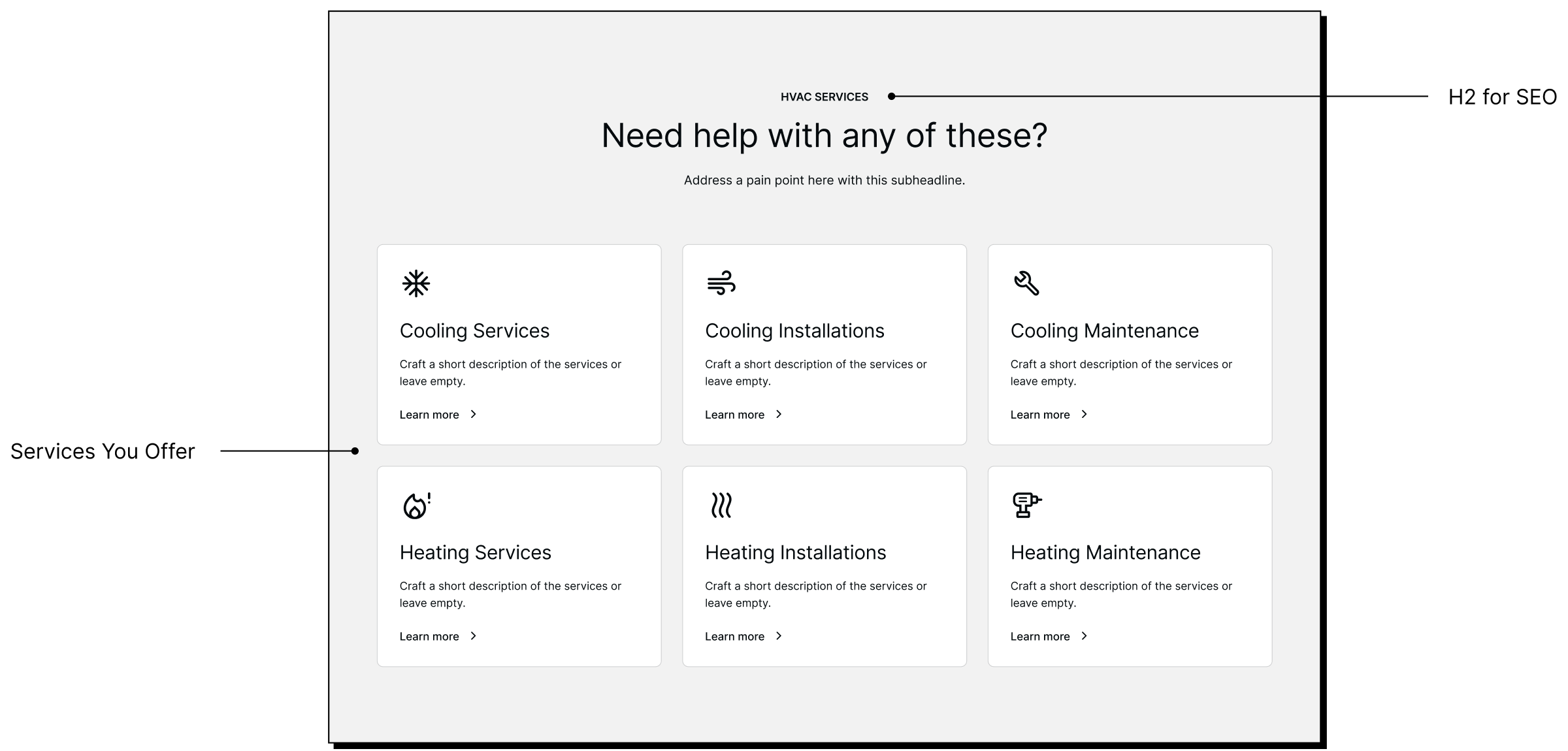
List your services by priority. The way you prioritize will depend on what matters most to you. If you want to focus on installations more than services or maintenance, then put it first. If it’s fall or winter, consider placing the cooling services on top, then switching them during spring and summer.
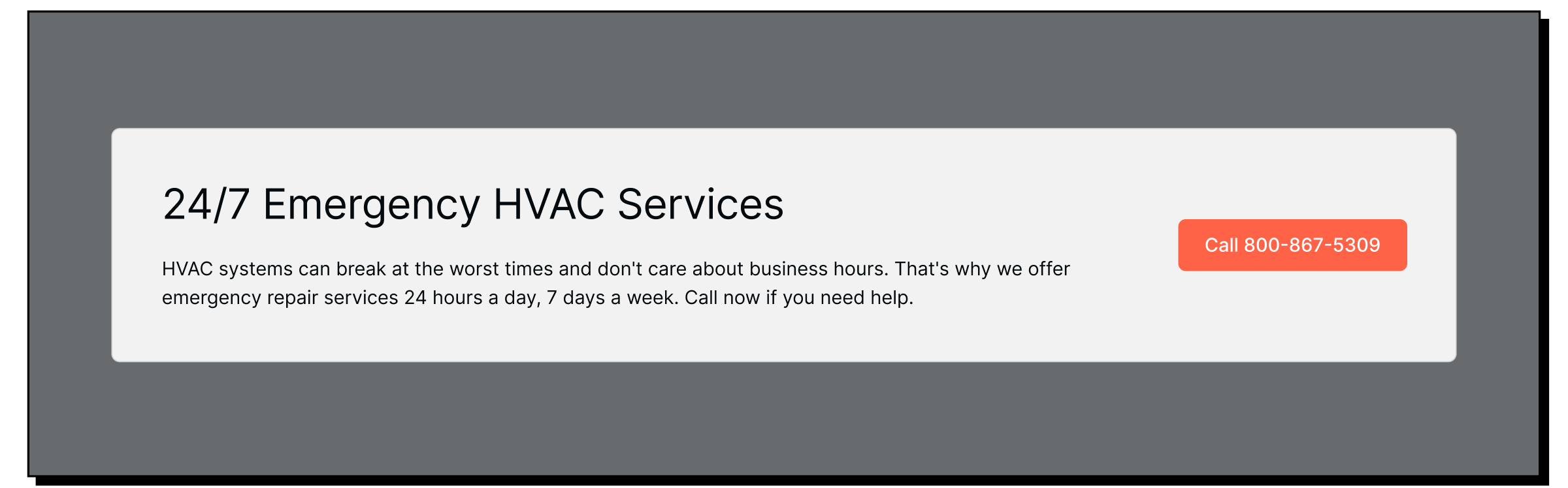
If you offer emergency services, make it clear by adding a dedicated section with a phone number they can contact 24/7.
There are two forms of proof. There’s what you say about your company, and there’s what others say about your company.
You can lead with some high-level reasons people should choose you.
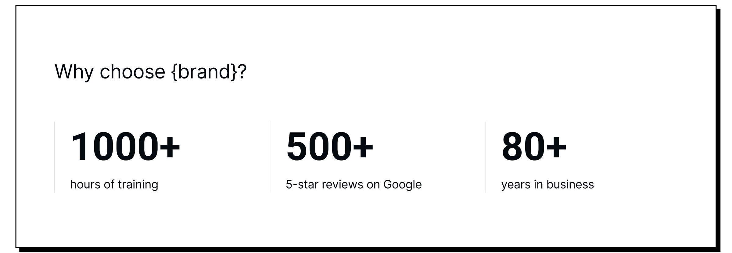
A common pattern for this is to provide the three most important stats. Limit it to three so people can quickly digest what’s important.
After that, validate it and build trust by showing what others have said about their experience. A common pattern here is to include testimonials or customer reviews from platforms like Google or Facebook.
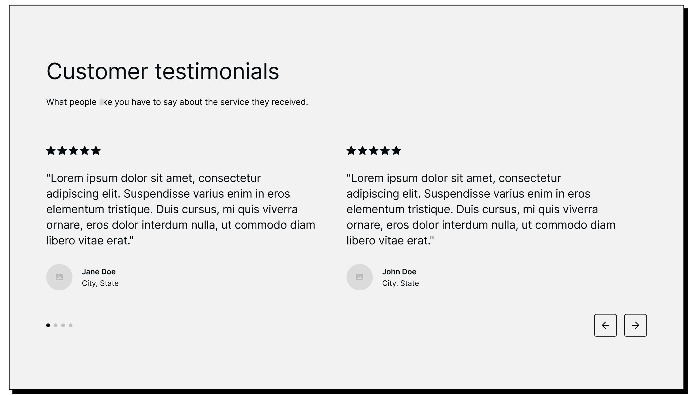
Include headshots of the people, their names, and where they’re from. The more specific you can get, the better. For example, if you’re adding reviews to a service page for VRV installations, the reviews should be from people who hired you for that service.
Not generic ones.
I know this isn’t always possible. That’s okay. Start with what you have and periodically update the page as you gradually get more reviews.
If you’re trying to sell to commercial services, spend more effort creating case studies and customer stories instead. A good customer story follows this general framework:
BONUS
If you get them to say this on video, you can cut it up into dozens of short-form content pieces you can advertise on social media organically or with paid ads.
There are two general approaches here. You can add a section that includes links to relevant blog articles or a section of FAQs.

I recommend FAQs, especially if you’re primarily marketing to residential customers. The questions you choose should be the most common obstacles/objections your sales reps have to overcome when closing deals.
Add a button that lets people submit their own questions, also (this is a less salesy way of generating leads).
A call-to-action (CTA) is what you want the visitor to do. Present your offer one more time toward the bottom of the page, right above the footer.
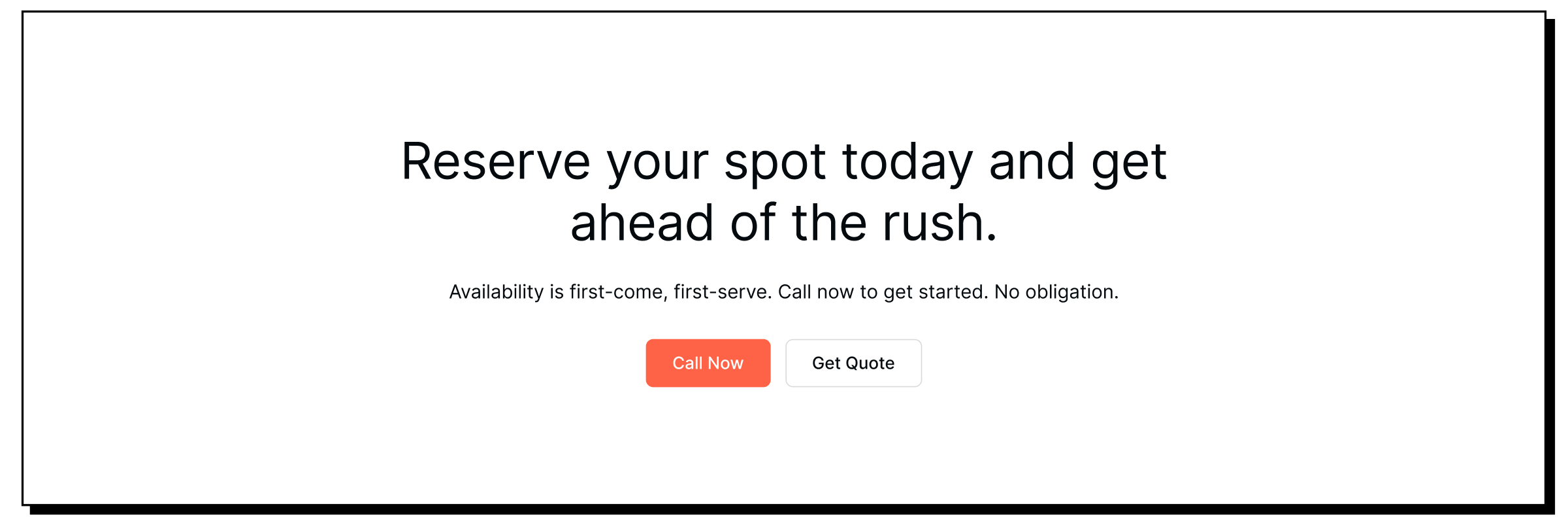
I wouldn’t repeat the exact same headline as you have at the top of your page. This is a great way to test a completely different headline that has the same general message, but said in a different way.
You don’t have to describe your service all over again, either. Visitors have already scanned through the entire page at this point.
Your footer is effectively an expanded version of your navbar.
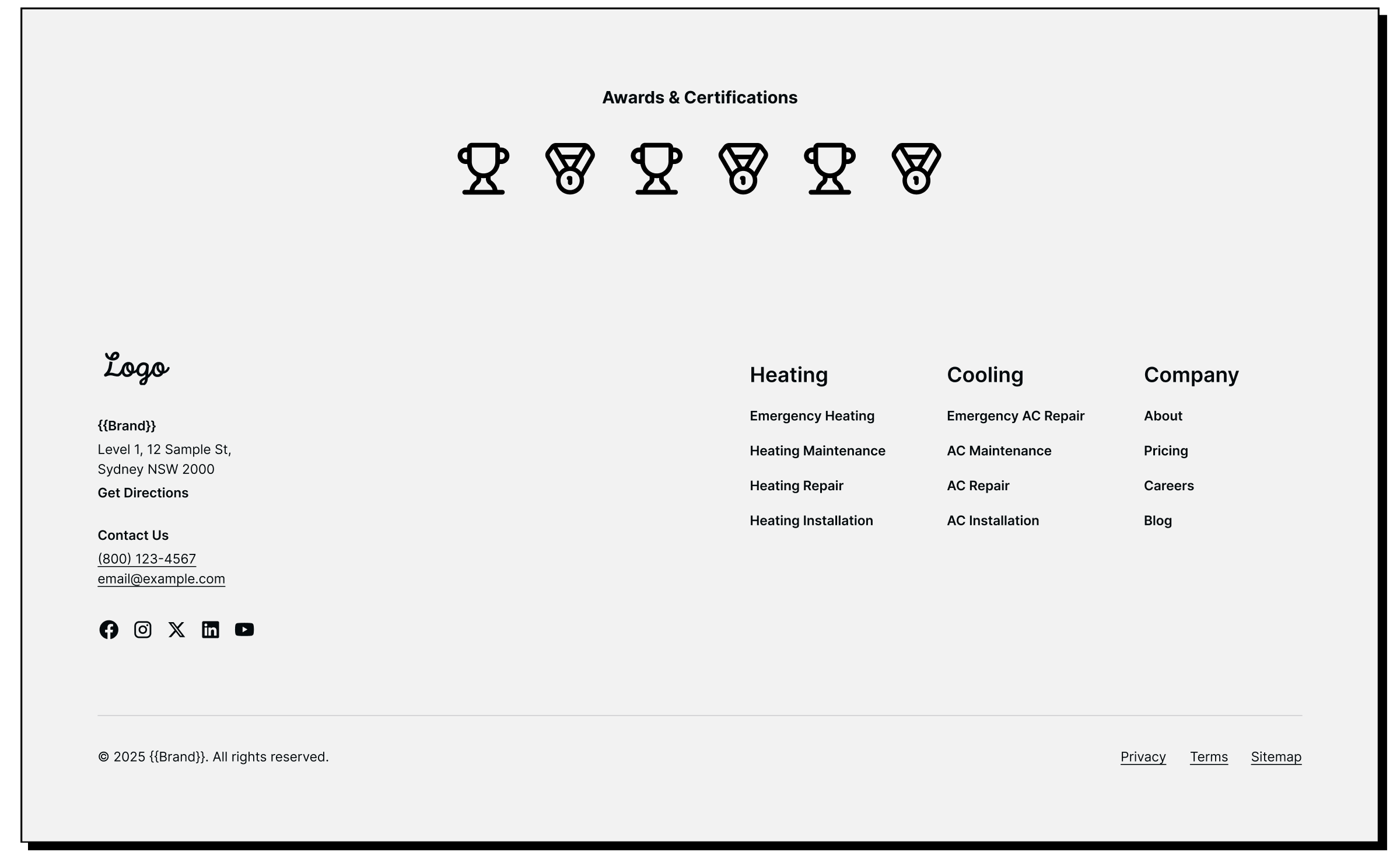
Don’t overthink things here. Include your brand, address, and other contact information. Most people expect it to be on the far left side of your footer. And if you do, it makes it often makes things easier on mobile devices also.
Include links to your social profiles that you’re active on.
Many people will click on social links as a way to get additional validation about your company. Sending them to a social page with little to no activity needlessly introduces doubt.
You can add other important links to pages on your site as needed. I recommend linking to your primary service pages.
The HVAC websites that perform the best aren’t accidents. They’re made by people who understand the science of good user experience design.
The words you say, the images/videos you include, and the order of things matter. They either move a visitor closer to becoming a lead or confuse them and cause them to leave.
You can learn how to do all of this and piece it together yourself. Or you can hire an agency with expertise in the HVAC industry like us if you want to save time, grow faster, and outperform your competition.
We’re experienced with several website builders here at Venveo. Whether you want a new website built with WordPress, Webflow, or some other platform, we can do it. Learn more about our custom website services →